Airtable
Airtable
Airtable
Airtable
Airtable
Role: Design Director
Client: Airtable
Agency: Anomaly
Role: Design Director
Client: Airtable
Agency: Anomaly
Role: Design Director
Client: Airtable
Agency: Anomaly
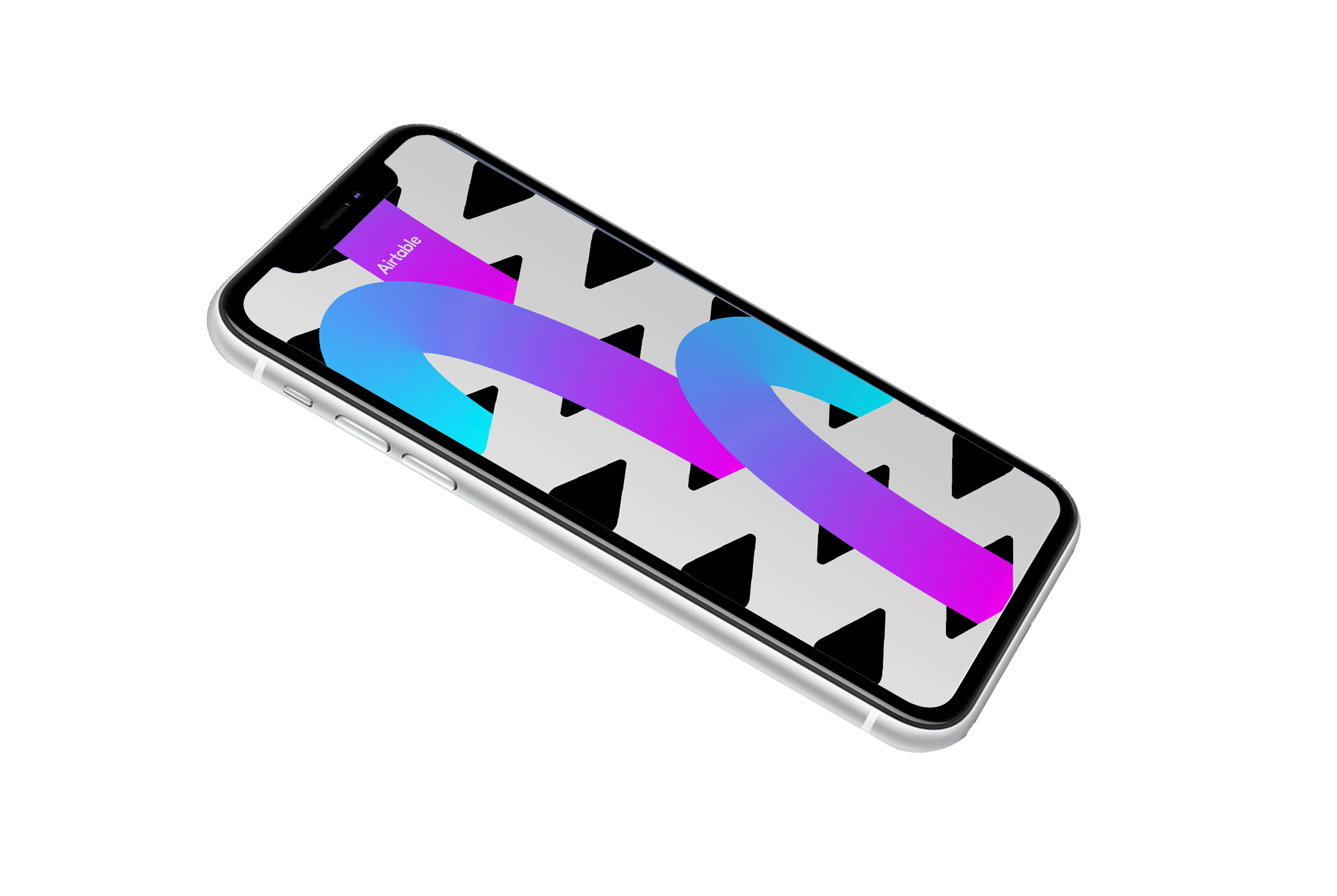
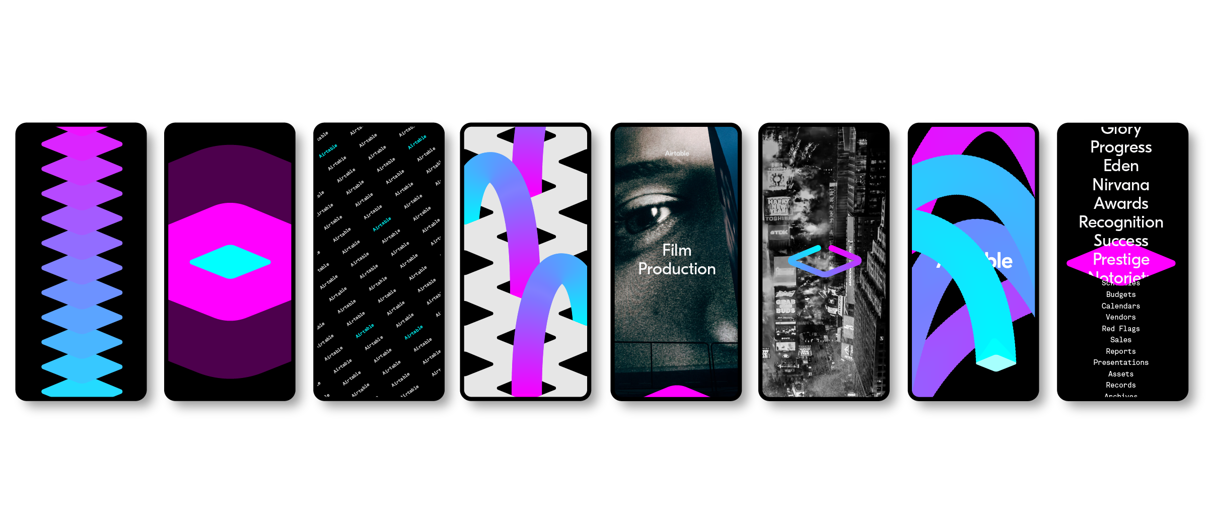
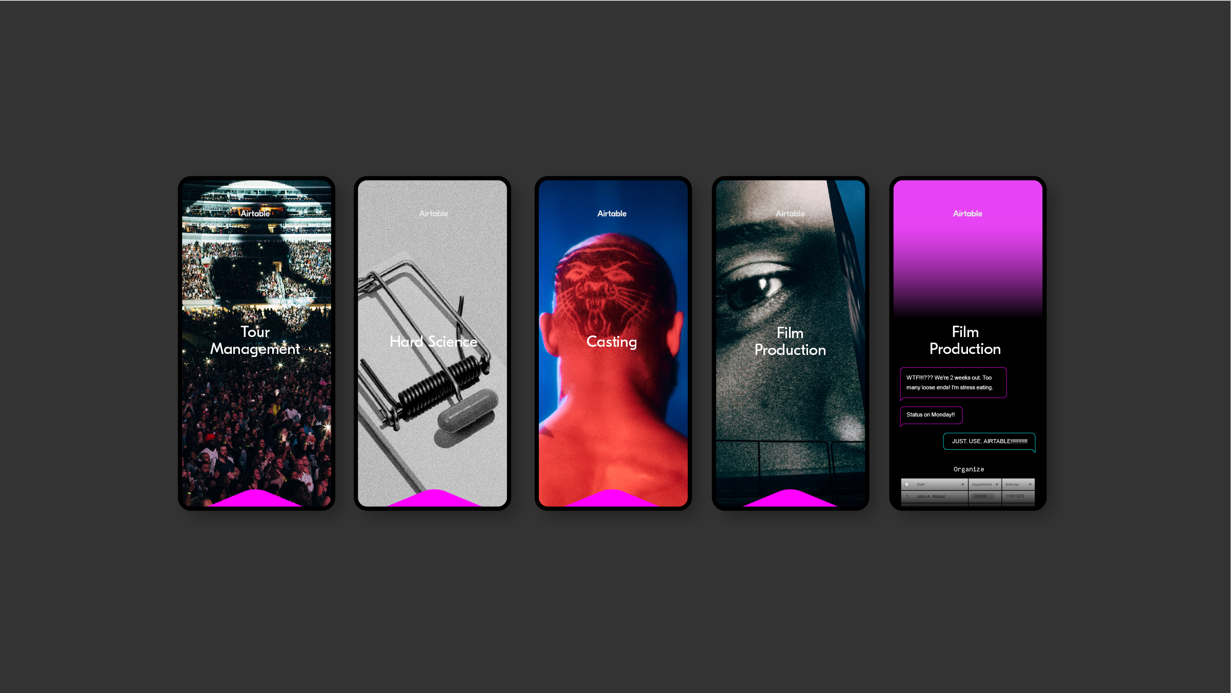
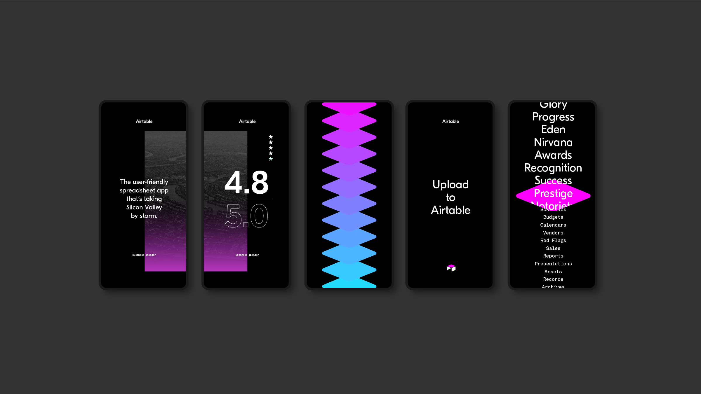
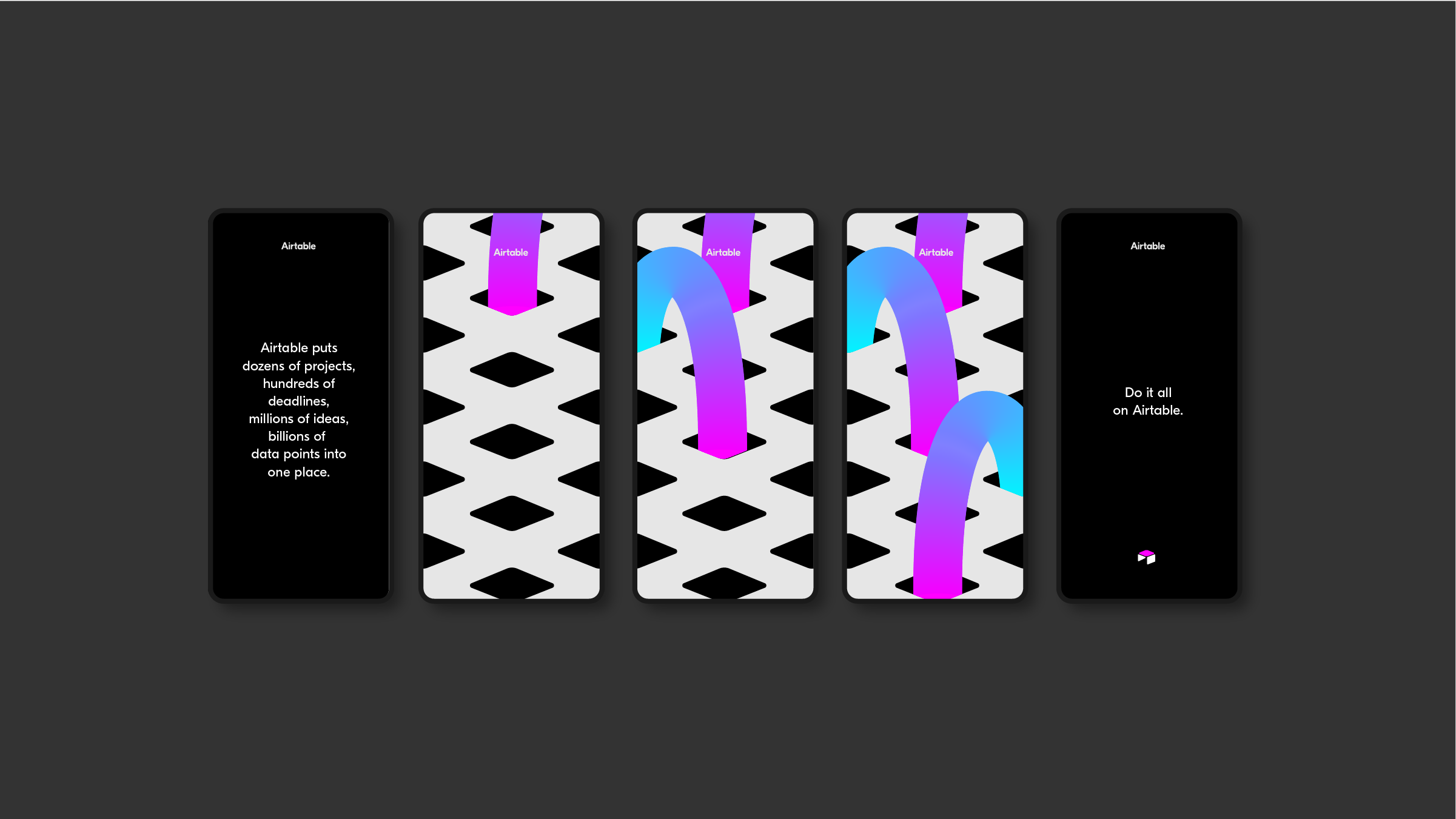
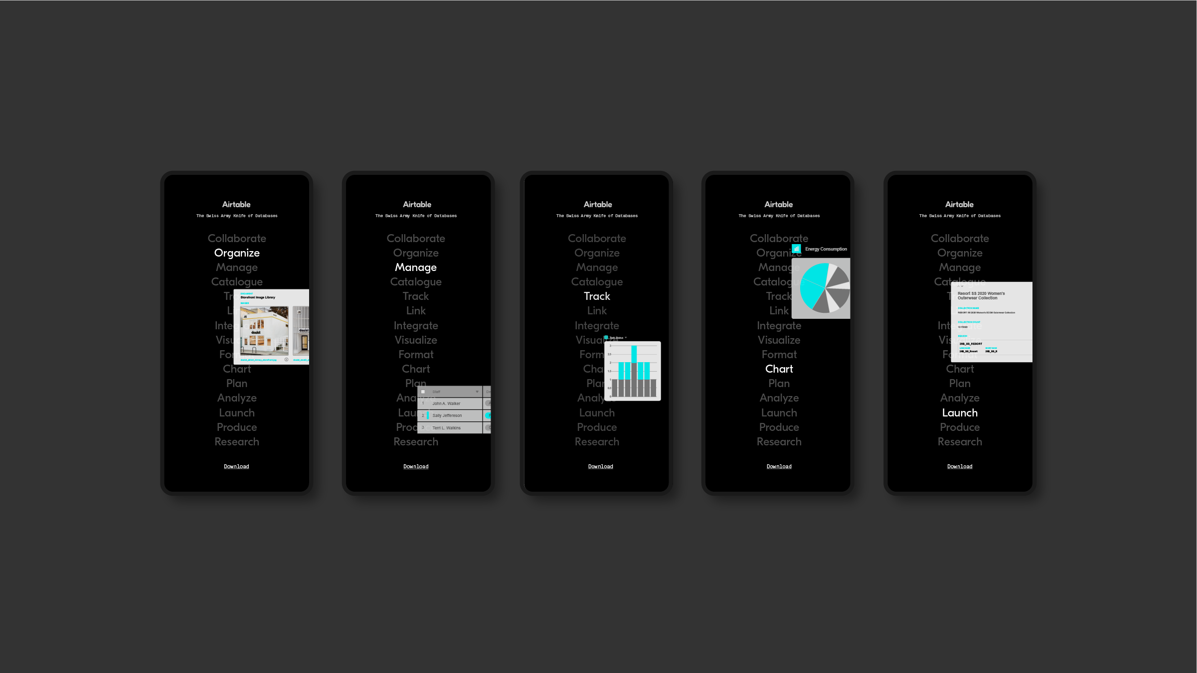
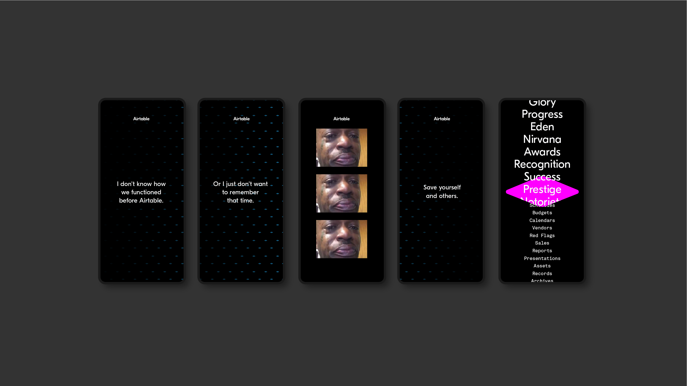
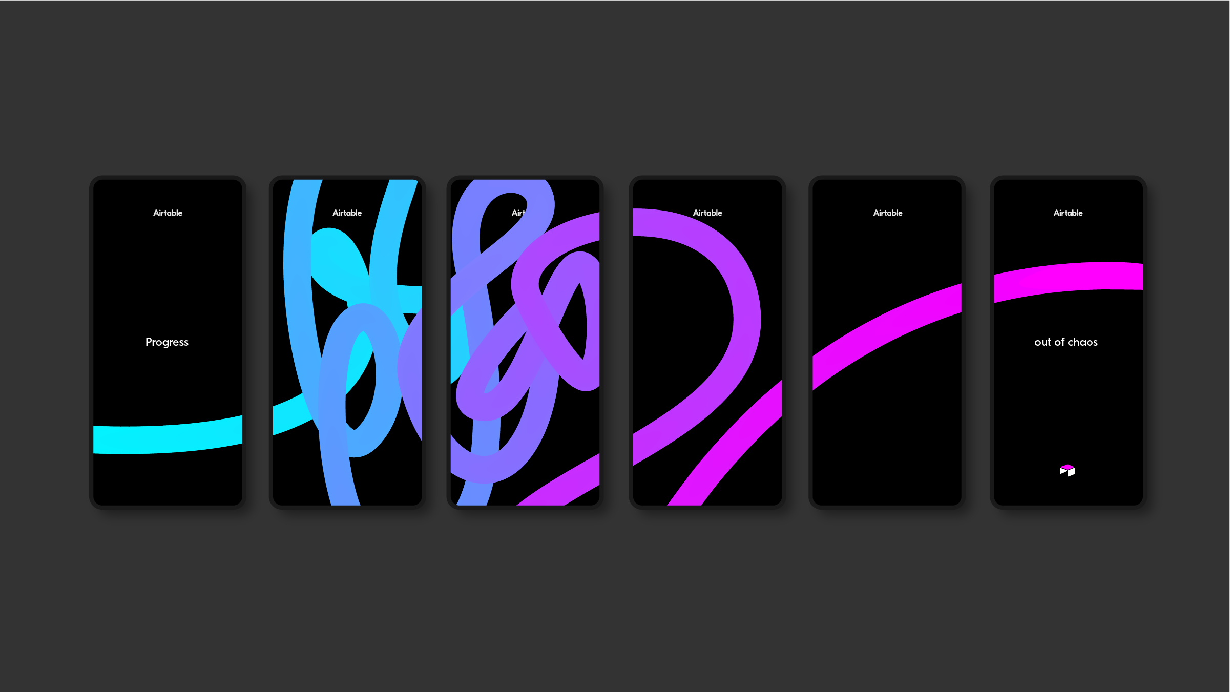
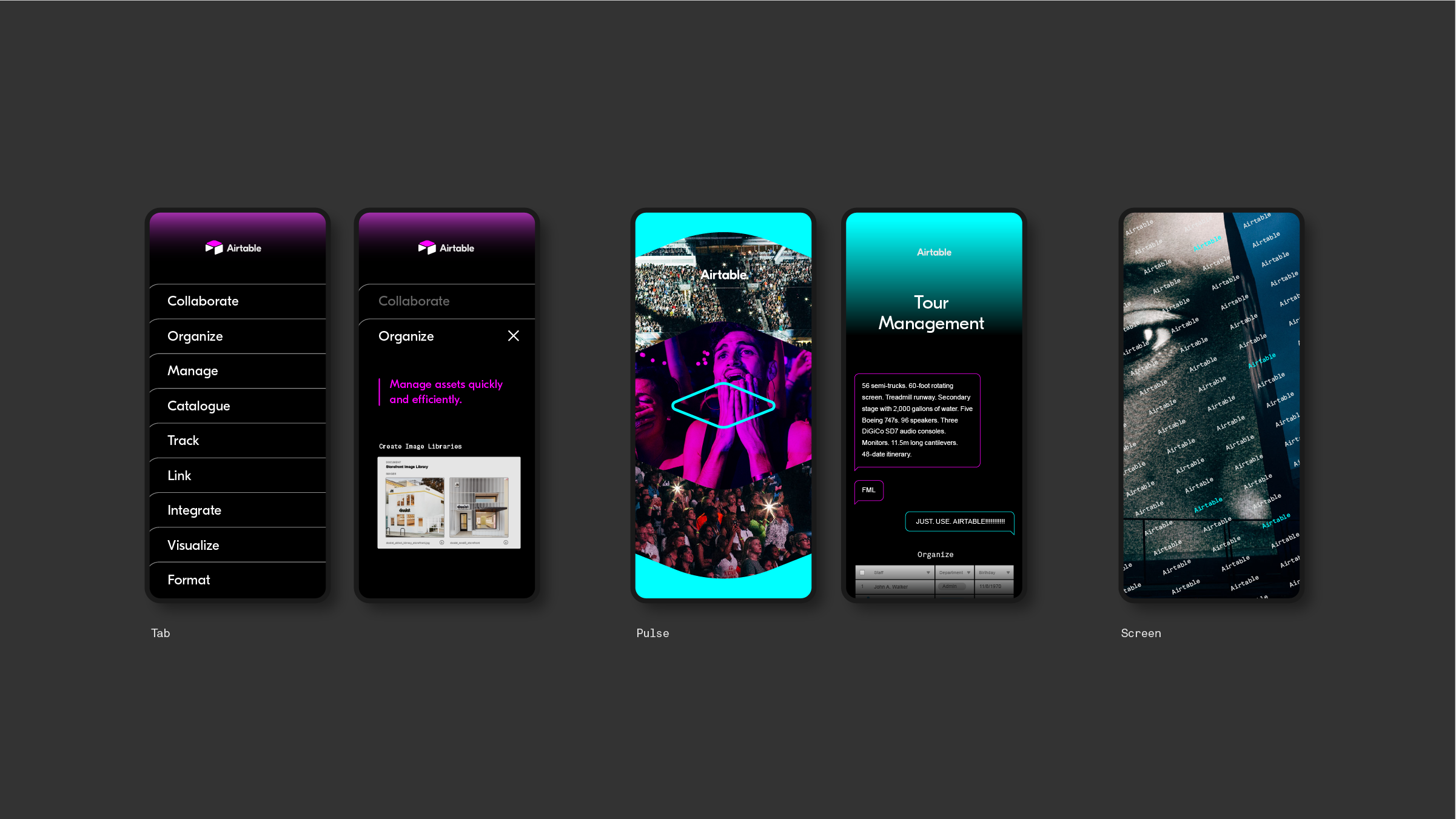
A VISION FOR AIRTABLE
Airtable came to Anomaly for help in clarifying and amplifying their product in the marketplace. Vision work was done for social. A toolkit derived from the Airtable symbol was developed and used in conjunction with their brand typeface and UI elements. An electrified color palette brought energy and interest. Using a simple mnemonic to ground the work, allowed us to address different types of content while remaining true to the brand.

© 2025
© 2025
© 2025
nathanbraceros@gmail.com
nathanbraceros@gmail.com
nathanbraceros@gmail.com