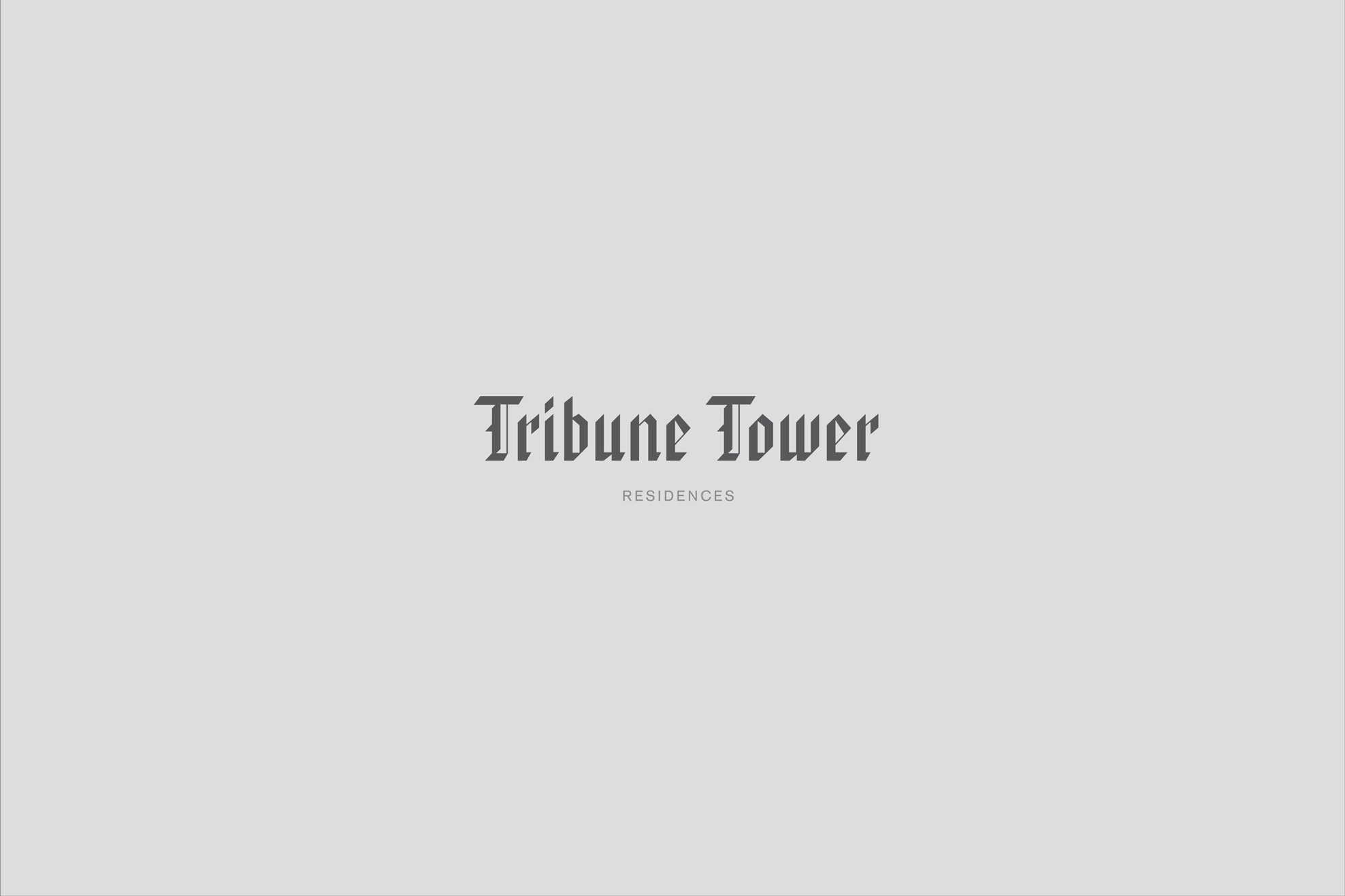
Tribune Tower
Tribune Tower
Tribune Tower
Tribune Tower
Tribune Tower

Role: Creative & Design Director
Client: CIM
Agency: REA
Role: Creative & Design Director
Client: CIM
Agency: REA
Role: Creative & Design Director
Client: CIM
Agency: REA
Role: Creative & Design Director
Client: CIM
Agency: REA
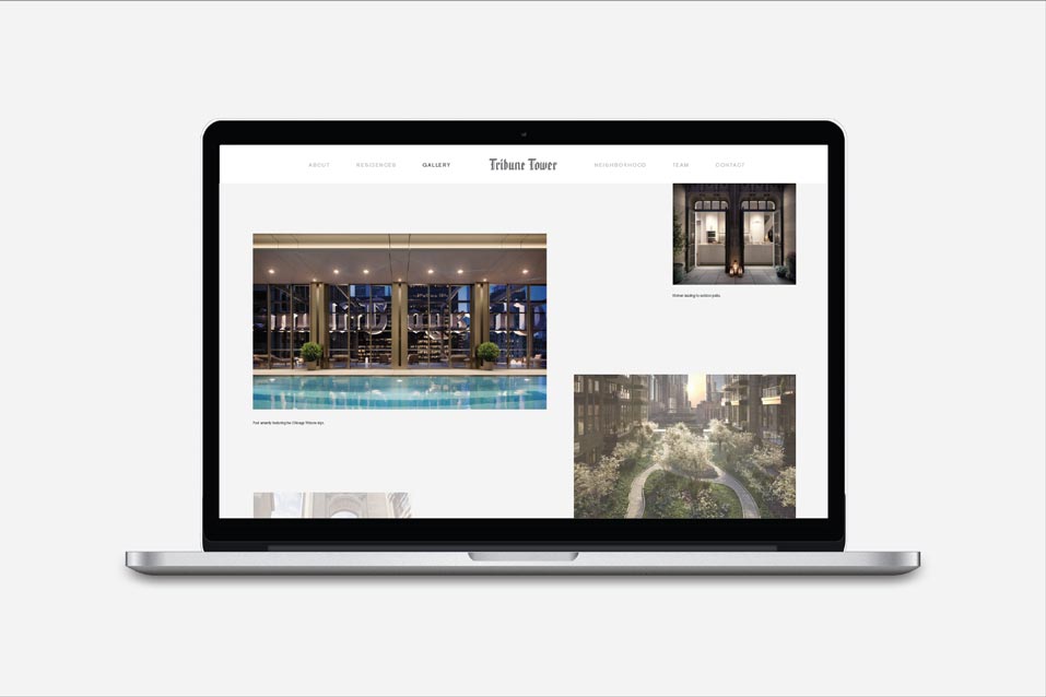
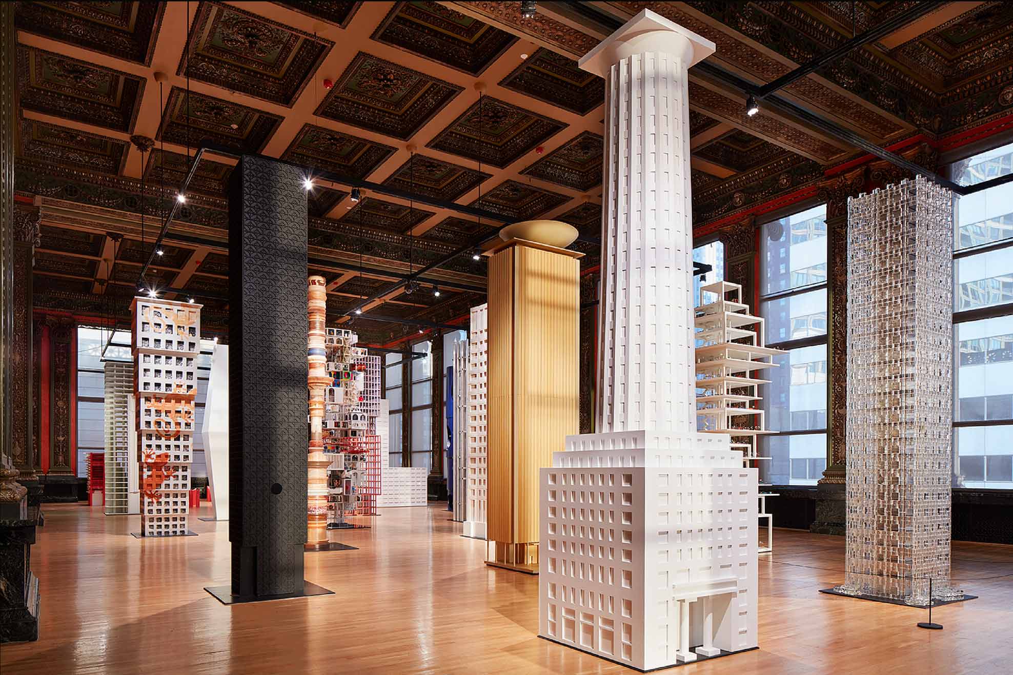
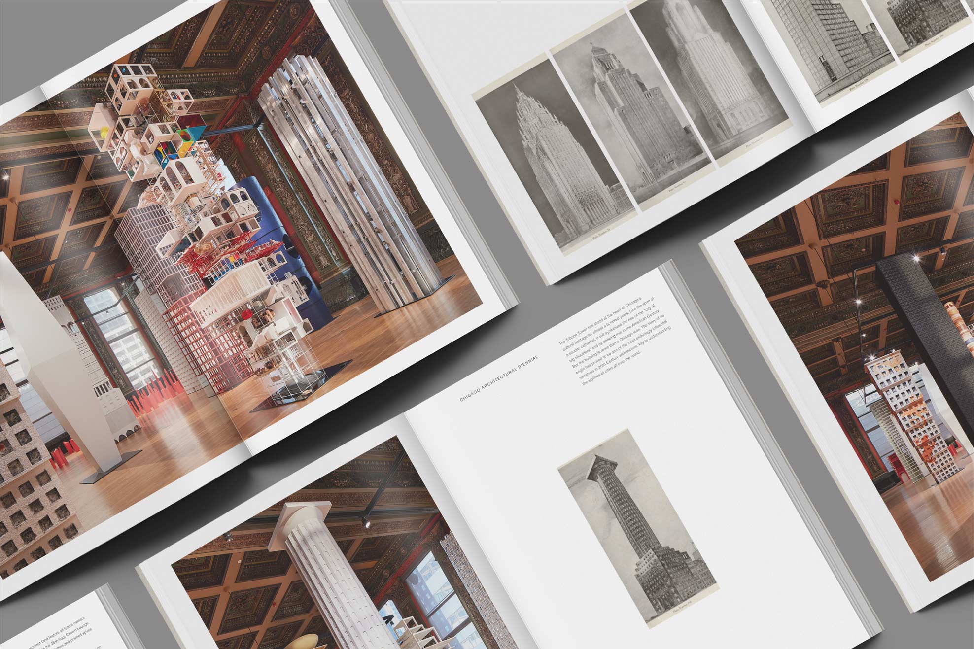
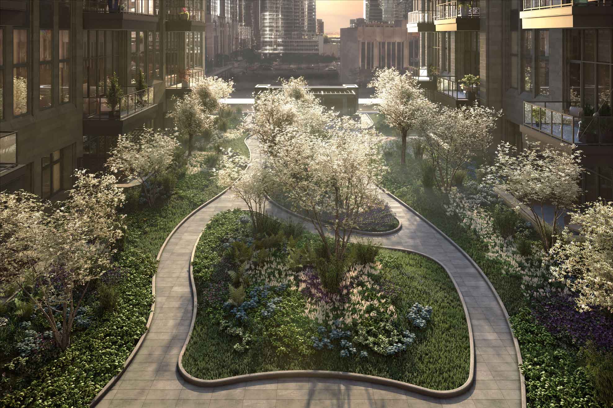
REINVISIONING A LANDMARK
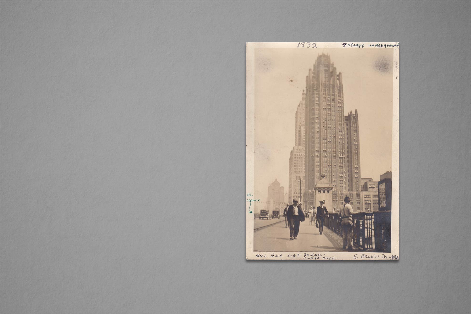
CIM requested vision work for Tribune Tower—once the home of the Chicago Tribune—as it was about to take on a new life as a luxury residential building.
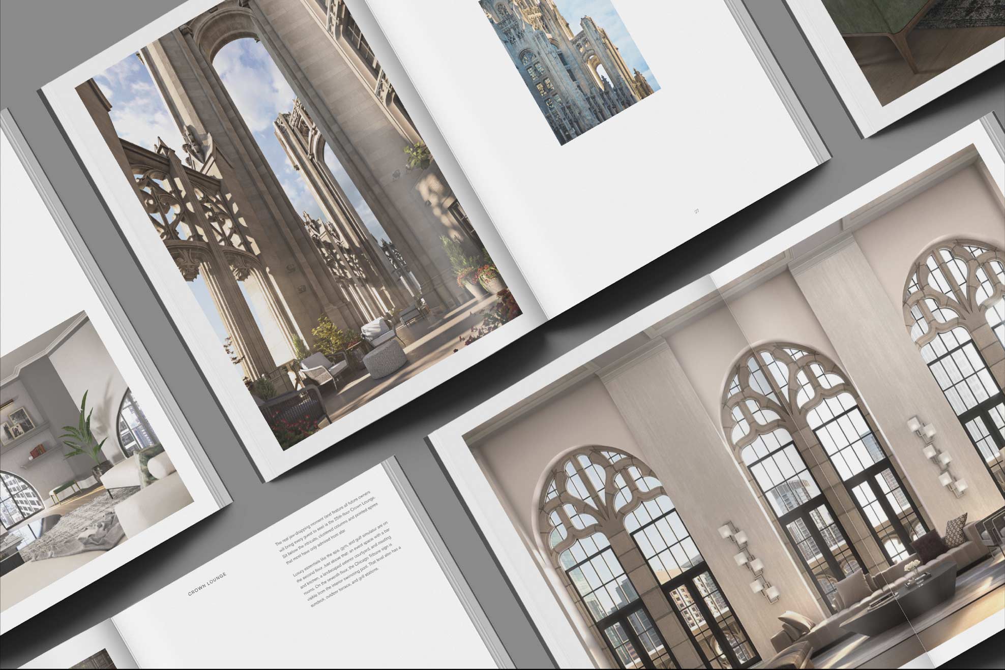
FUSING THE PAST & PRESENT
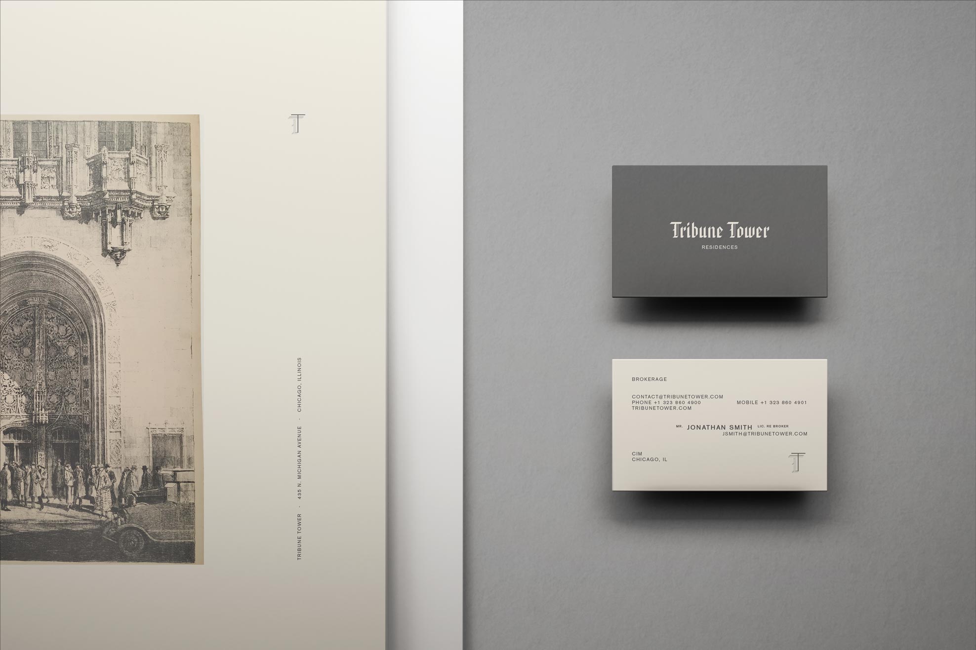
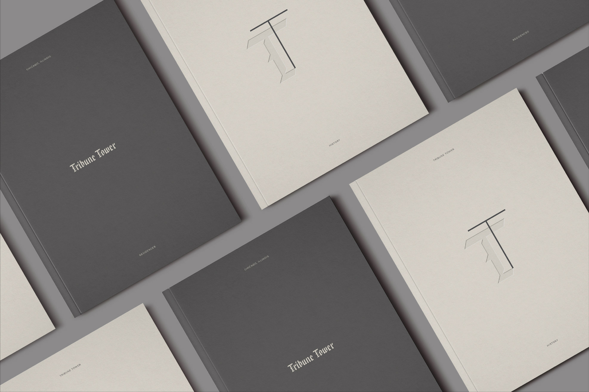
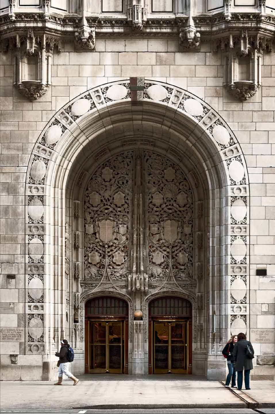
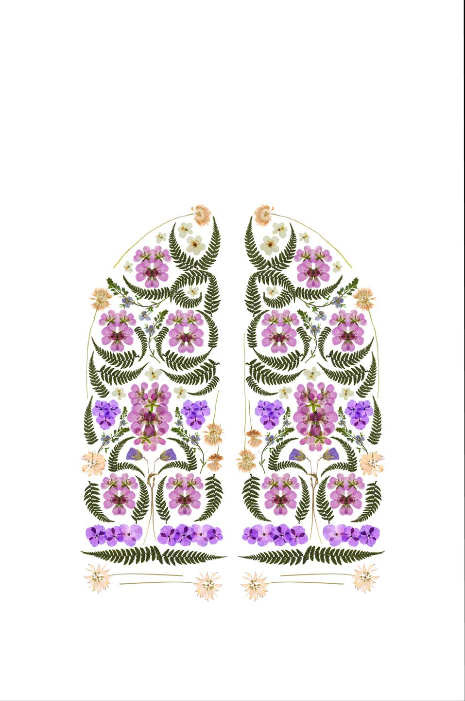
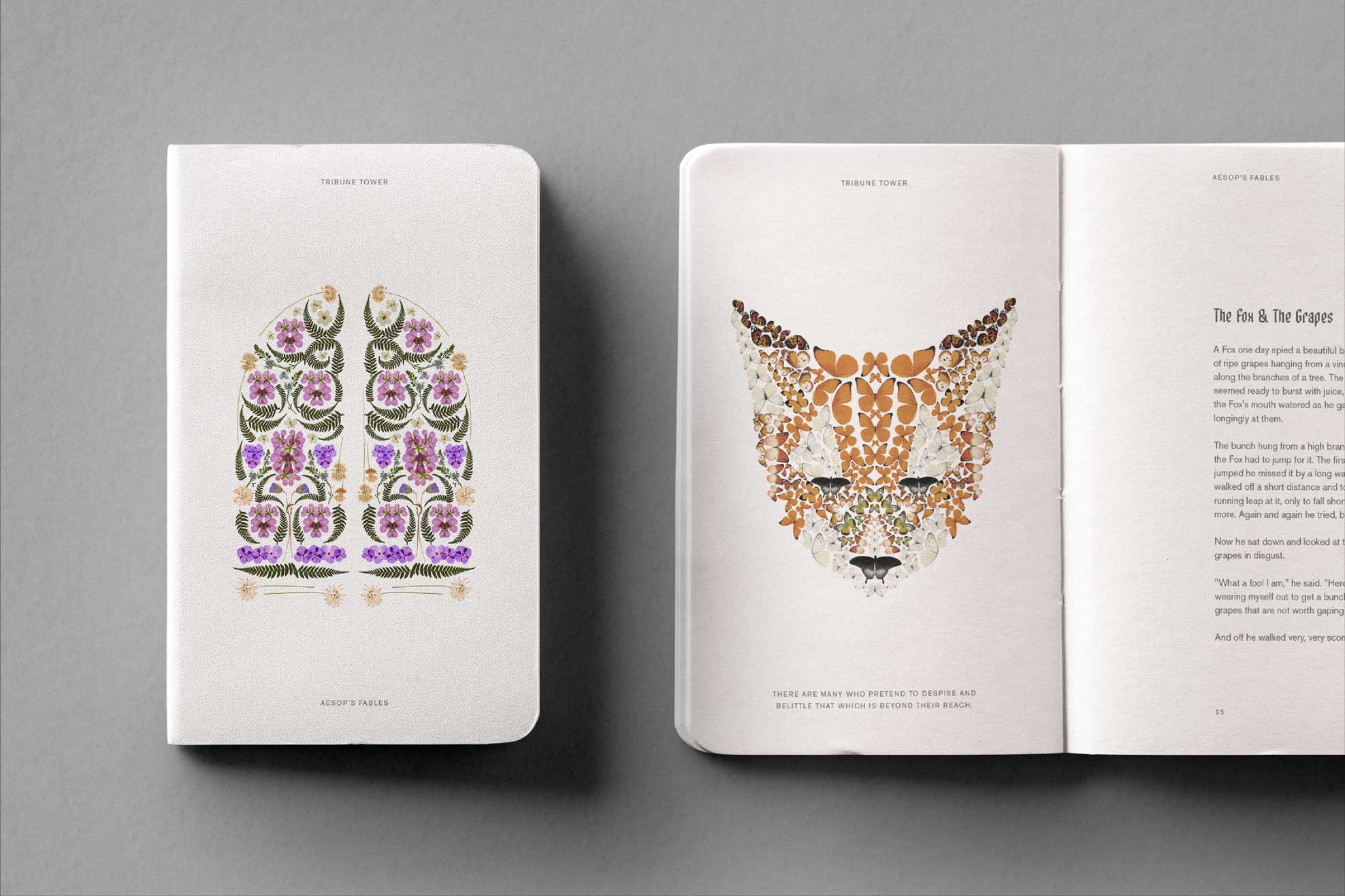
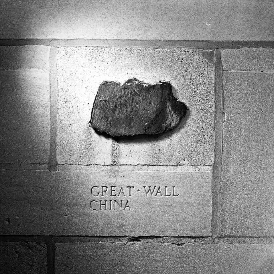
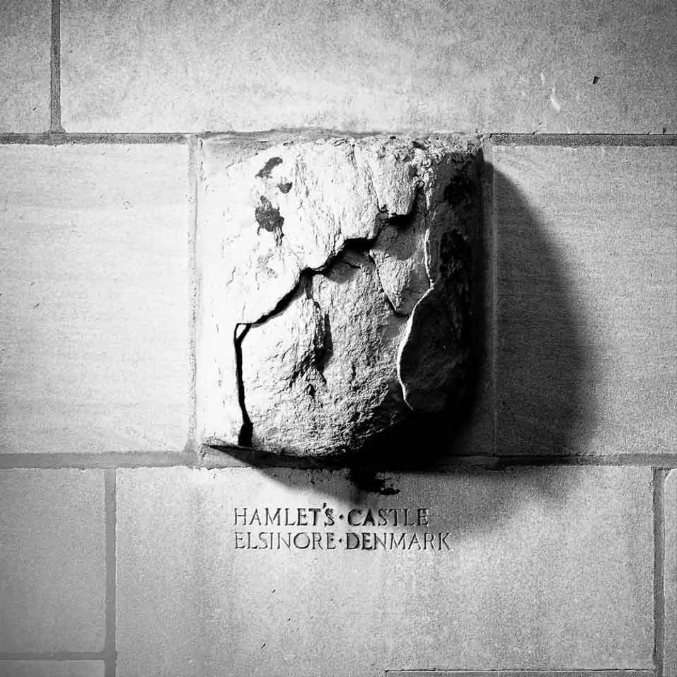
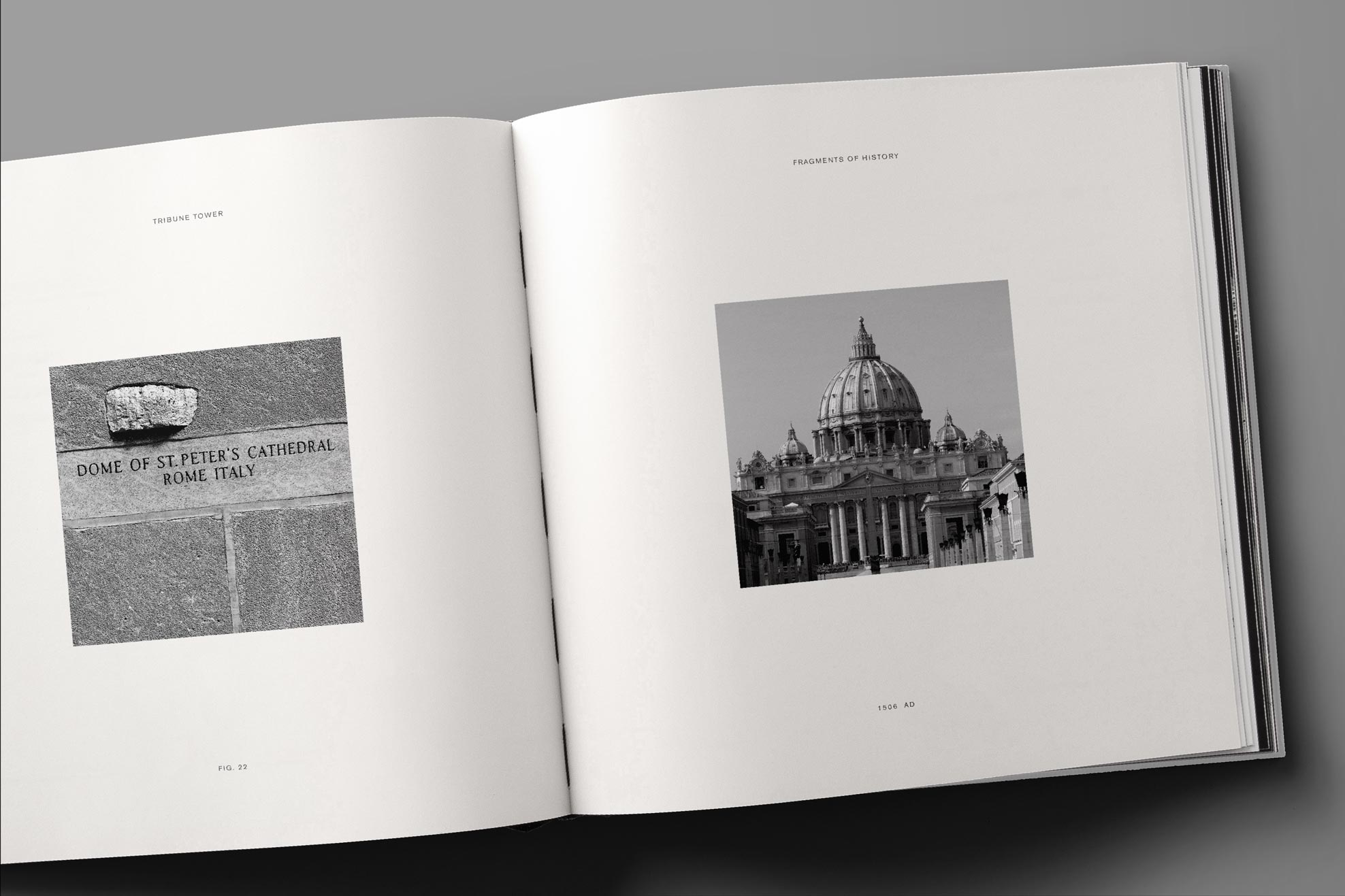
The brand combined the past and the present while highlighting the tower's most exciting features. The brand mark consists of two interlocking Ts—a thin contemporary sans serif with a gothic shadow—an homage to modern life, its neo-gothic architecture, and its connection to the Chicago Tribune. Print pieces highlight the original design competition of 1922 & the corresponding 2017 Chicago Architecture Biennial, artist renderings, and architectural details which include artifacts from famous structures affixed to the building's façade. The Aesop Arch hanging above the main entrance inspired butterfly and pressed flower illustrations for a children's book.
REINVISIONING A LANDMARK
CIM requested vision work for Tribune Tower—once the home of the Chicago Tribune—as it was about to take on a new life as a luxury residential building.
FUSING THE PAST & PRESENT
The brand combined the past and the present while highlighting the tower's most exciting features. The brand mark consists of two interlocking Ts—a thin contemporary sans serif with a gothic shadow—an homage to modern life, its neo-gothic architecture, and its connection to the Chicago Tribune. Print pieces highlight the original design competition of 1922 & the corresponding 2017 Chicago Architecture Biennial, artist renderings, and architectural details which include artifacts from famous structures affixed to the building's façade. The Aesop Arch hanging above the main entrance inspired butterfly and pressed flower illustrations for a children's book.
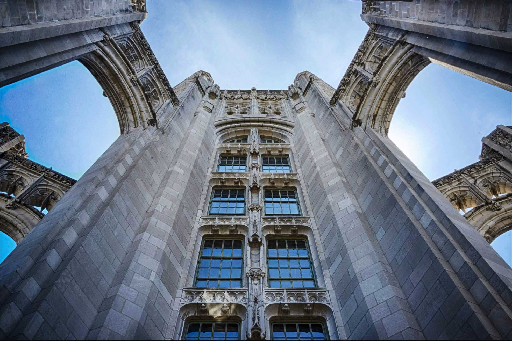
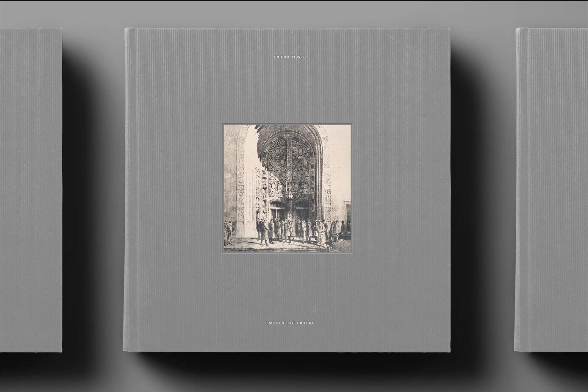
A collection of 149 stones affixed to the facade of Tribune Tower.
A collection of 149 stones affixed to the facade of Tribune Tower.
A collection of 149 stones affixed to the facade of Tribune Tower.
© 2025
© 2025
© 2025
nathanbraceros@gmail.com
nathanbraceros@gmail.com
nathanbraceros@gmail.com